Bitcoin Rainbow Chart

0
0
The Bitcoin Rainbow Chart is a visual tool that helps traders understand Bitcoin’s price trends. It uses different colors to show whether Bitcoin’s current price might be cheap, expensive, or just about right, based on its history.
Let’s break it down simply and clearly.
What Exactly Is the Bitcoin Rainbow Chart?
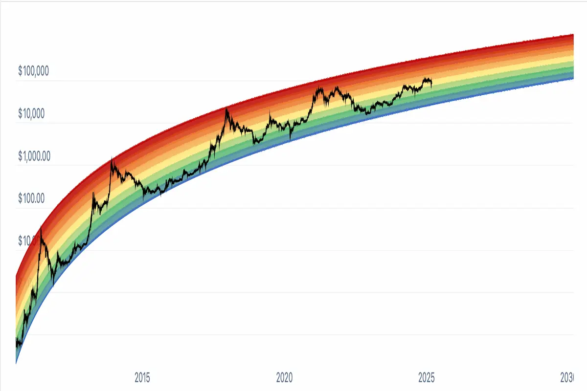
The Rainbow Chart is a long-term price chart for Bitcoin. It plots Bitcoin’s price movements using a special scale called a logarithmic scale. This type of scale helps show Bitcoin’s growth clearly, even when prices move dramatically.
The chart uses different rainbow colors to highlight different phases of the market. Each color band represents how high or low Bitcoin’s price is compared to past trends.
How Does the Rainbow Chart Work?
To create the Rainbow Chart, analysts take historical Bitcoin price data and apply a mathematical formula called a logarithmic regression curve. This curve follows Bitcoin’s general long-term growth.
The curve is then divided into color bands from blue at the bottom to dark red at the top. Each band indicates a price range, helping investors quickly see if Bitcoin might be undervalued (cheap), balanced (fairly priced), or overvalued (expensive).
Here’s what each color typically means:
- Blue (Lowest Band): Bitcoin is very cheap. Prices are historically low and might signal a good buying opportunity.
- Green and Light Blue: Bitcoin’s price is low or affordable compared to its historical growth. These bands suggest good times to buy or accumulate Bitcoin.
- Yellow: The price is balanced or fairly valued. Neither cheap nor expensive, this usually means holding Bitcoin is wise.
- Orange: Bitcoin’s price is starting to get high, indicating increased interest or excitement. Investors might be cautious.
- Red and Dark Red (Highest Bands): Bitcoin prices are very high compared to historical trends. These bands indicate Bitcoin might be overpriced, suggesting investors might want to sell or take profits.
Why Is the BTC Rainbow Chart Popular?
The Rainbow Chart is popular because it’s easy to understand. Even beginners can quickly see if Bitcoin might be cheap or expensive based on historical data.
Traders also like it because it clearly shows Bitcoin’s market cycles. Bitcoin tends to move through regular cycles of rapid growth, followed by sharp declines. The chart helps investors visualize these cycles clearly.
Bitcoin Halving and the Rainbow Chart
Bitcoin halving events happen roughly every four years. During these events, the rewards Bitcoin miners receive for verifying transactions are cut in half. This makes Bitcoin more scarce and can lead to price increases.
Historically, Bitcoin’s price has usually been lower around halving events, placing it in the cooler colors of the Rainbow Chart. After a halving, prices often rise into warmer colors like orange or red as excitement and demand grow. However, this historical pattern might not always repeat itself, so investors should remain cautious.

Is the Bitcoin Rainbow Chart Always Accurate?
No tool is perfect, and the Rainbow Chart is no exception. It’s based on historical data, meaning it can’t perfectly predict future prices. Bitcoin’s price can change quickly due to unexpected events, new regulations, or shifts in investor sentiment.
This means investors should use the Rainbow Chart as just one of many tools when making investment decisions. Combining it with other types of analysis can give a clearer picture of Bitcoin’s market position.
How to Use the Bitcoin Rainbow Chart
The Rainbow Chart is most useful for long-term investors. It helps them identify general buying and selling opportunities based on historical trends:
- Buying Strategy: When Bitcoin’s price sits in the cooler color bands like blue or green, investors might consider buying or accumulating more Bitcoin.
- Selling Strategy: When Bitcoin moves into the warmer bands like red or dark red, investors might consider taking profits or being cautious.
The Rainbow Chart isn’t as helpful for short-term trading because Bitcoin prices move up and down quickly in the short run. Investors looking at long-term trends find it more useful.
The Bitcoin Rainbow Chart is a simple, colorful way to visualize Bitcoin’s price trends over time. It helps investors quickly see whether Bitcoin might currently be cheap, expensive, or fairly valued based on historical data.
While helpful, the Rainbow Chart shouldn’t be used alone. Investors should always consider other tools and methods when making decisions. By combining the Rainbow Chart with careful research, investors can better understand Bitcoin’s market cycles and make smarter choices.
0
0

 Gerencie todo seu criptograma, NFT e DeFi de um só lugar
Conecte com segurança o portfólio que você está usando para começar.


0
0

